InfoXtra - My first logo design
I'm working on some designs for a new web app for a project at work.
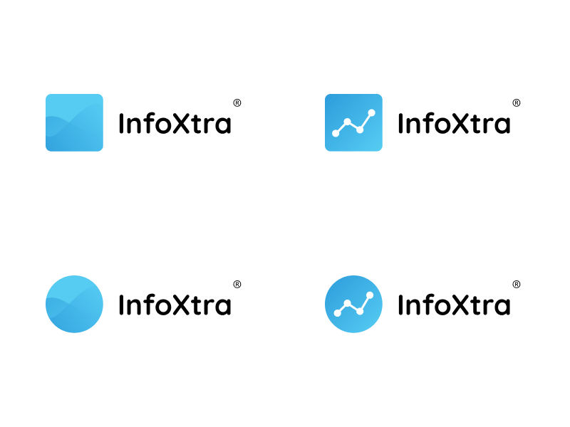
I've changed the name of the app, but the logo, font, colours, etc, are the same. As a UI designer, this is my first real go at trying to do logo/brand design.
The app will show a lot of statistical data, charts, graphs, tables, etc, so I tried to symbolise that in the design. The two logos on the left are supposed to show two seperate line/area charts, wheras the two on the left are more obvious line charts.
I'm leaning towards the top right, but I'd really appreciate some feedback on the designs in general.
Hit 'L' if you like!
