RapCaviar - Spotify
I have been very fortunate to call Spotify my client this year, writing and designing titles for RapCaviar & RockThis.
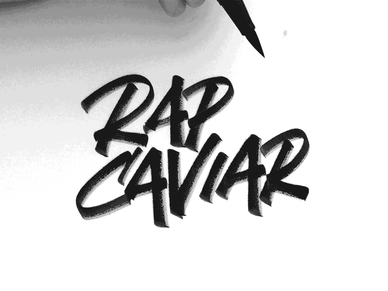
This video is a demo of one of the variety of styles we go between for the handwritten work I do for RapCaviar.
To get the desired texture I use the reverse side of bleedproof paper. It's a little more waxier so the ink behaves differently. Does feel weird using the wrong side of expensive paper.