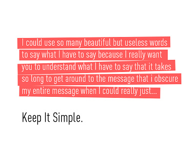
Less Is More
I know how tempting it is to write on our sites like we do in other mediums (like this one), using enough words to fully convey the concept at hand, and focusing more on a complete ideological message than on a direct user-based message and a temporal need. I totally get it: we want our websites to convey all of who we are and what we do to everyone in the few moments they’re with us. We believe that if we don’t accomplish that impossible task that a visitor will be lost forever.
The truth?
- Long, idealogical statements often serve the collective organizational ego, and not the first need of the user.
- Direct statements require humility and abandoning your own need for recognition in favor of what scratches the itch of your user.
- Words are just one small part of your bigger vehicle of expression: an intentional visual design. Rely symbiotically on it.
- Users who want to be there will stay.
- You don’t need more words. You need better words.
How to combat wordiness?
- Question all your modifiers (adjectives, adverbs, nonsense words).
- Use valuable words.
- Strike valueless words.
- Be direct.
- Refer to style guidelines over and over again.
- Remember that your user’s experience is, truly, a self-guided one. Your job is to distinguish what they may be looking for from what they’re not.
- Avoid clichés and jargon when not valuable.
- And, of course, keep it simple.
-----
Looking for a design partner? Talk to us: hello@focuslabllc.com.
