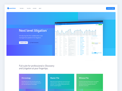
Everchron 3.0 Home Page
The last month I was busy rebranding, redesigning and rebuilding the entire web presentation of everchron. We moved away from the "stripe-y" look to a more unique branding, which still makes great use of a vibrant color theme.
More by Ivo Mynttinen View profile
Like

