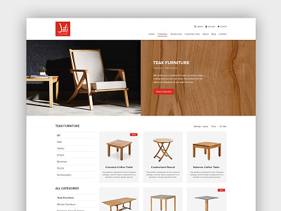
Jati Furniture Website - Category Page
Here is the category page layout. Clean and legible were the goals here. Maybe the background texture (wood) in the header giving a visual interpretation of where the user is is a little tacky?
More by SubCreative View profile
Like

