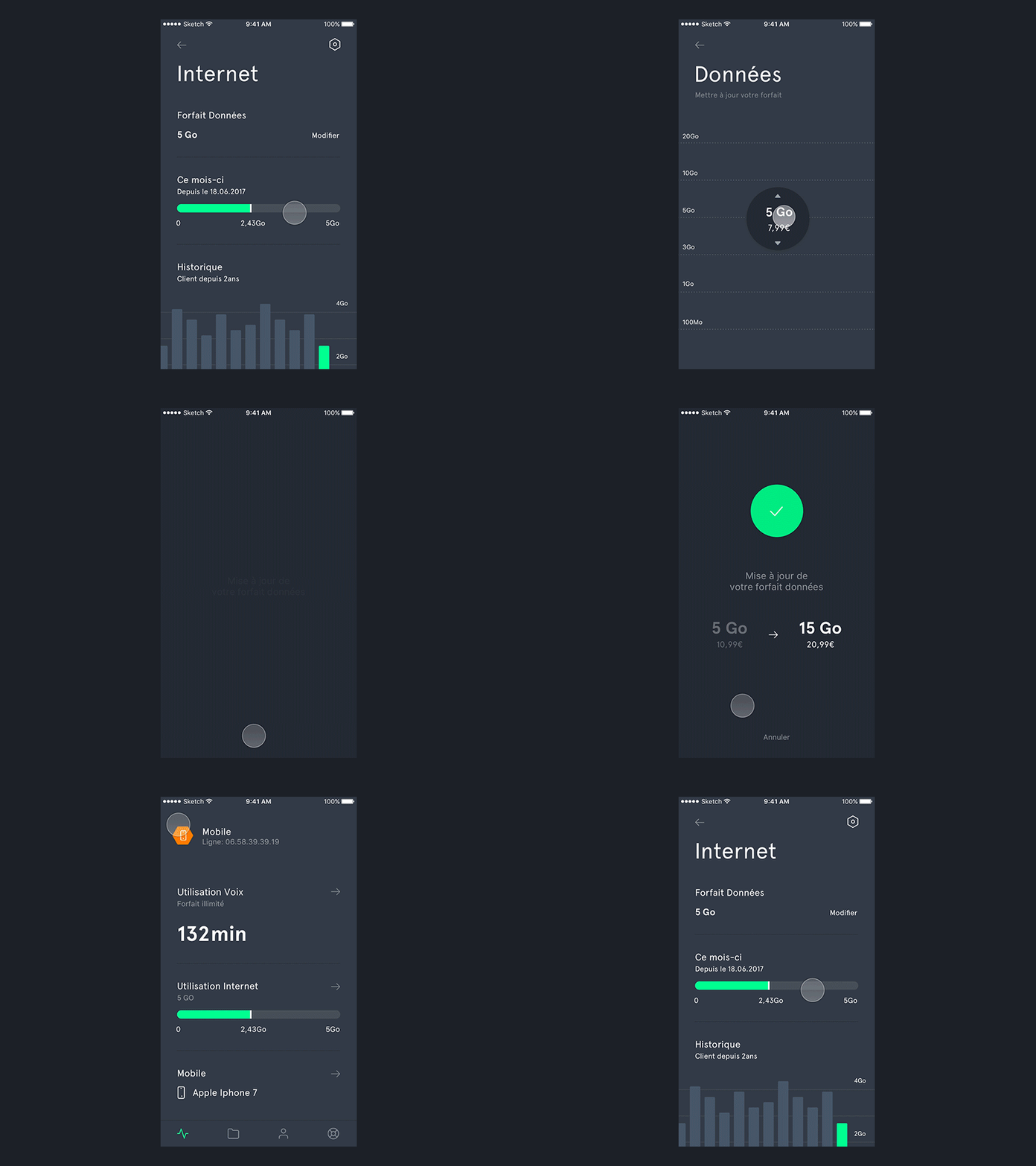
Mobile Data plan update - Concept
👋Hey dribbblers. It’s been long time. What if you could upgrade or downgrade your mobile data plan in just a few taps? I’ve been exploring both navigation and interaction ideas I had. From the app home screen you can see at a glance how much data you’ve used (and therefore how much remains). You can dig into your mobile data details and easily change your plan. The upgrade or downgrade flow is meant to be fun yet usable. Once you hit « Update your plan » the change only takes a few second to be registered. And then you’re good to stream hours of movies.
From a visual perspective, I wanted to explore a tech oriented user interface, while making it breaths (by having large paddings and margins). Overall, I like that aesthetic. 🙌
I hope you’ll like it as well, and if so, feel free to share some love 😻


