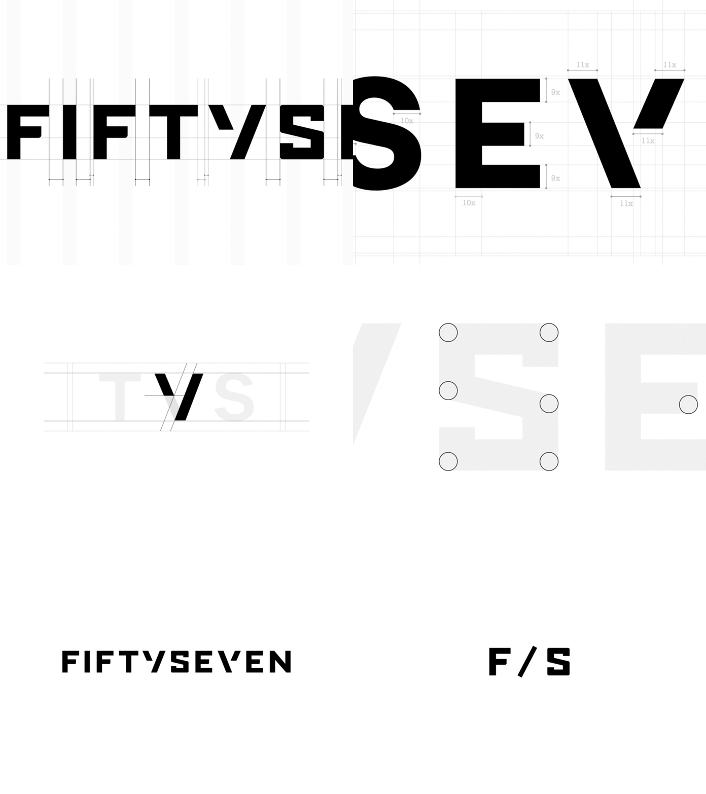
Fiftyseven — Typography Final
Cleanup, final adjustments and grid defining on our selected typography.
We worked on cleanups to make typography pixel perfect. Due to different kerning iterations and white space that has few isuess to be solved we came up with geometric solution that fits perfect into overall feel and look. System for the grid represents well balanced spacing with aim to use 3 different segments on the places where we need less or more space (whole s.1/1 ; half s.1/2 and quarter s.1/4).
Check out the attachment in order to dig the grid itself and the whole clean-up process. :)
More by FIFTYSEVEN View profile
Like


