The Grind Coffee
The fictional client for this project said in their brief:
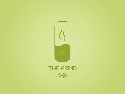
"The Grind prides itself on natural and local ingredients. For our new logo, we actually do not want to use any browns! So many coffee shops around here use brown and we'd like to stand out. Maybe oranges, green, other earth tones, etc. could work well"
so I used the color green to show that its from nature and you can see the seed in the flask. An original coffee in the making
The steam is also a shadow of an invisible G