North Bank Mobile Application


Mobile App for "North Bank".
To try the prototype click -> https://goo.gl/A56ZiF
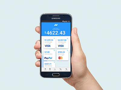
The mobile application is to show a clean and easy to navigate interface, with the user in-mind.
The color scheme for the application reflects a clean and friendly system with a cool tone. Blue is the primary color used throughout the application, with gray as the supporting color.
This mobile banking application features easy to read text with accessibility in mind. The font Roboto (Google’s featured font) is a familiar font to the average user, making it easier to identify.
The icons are generally universal icons on all mobile phones, with some custom icons to better signify the information. For example, the bill and transfer (arrows) icons, were not adapted from android or ios.
I went with a simplistic logo that showcases connection, flow, and simplicity. The three blue ribbons represent a connected, unified application. The movement in the logo also is a symbol for the ups and downs in the stock market, and when read from left to right, ends in an “up”, signifying a positive outcome. Last, it represents the “N” for the letter in the name North Bank.
The following screens showcase the design and placement for possible pages within the application. Loading screen - A simple animation will pop up the logo. Login screen - The loading screen will dissolve and the login screen will be revealed. Clients/users can either login or signup for a new account. On-boarding screen - This is for new users. A quick three-screen infographic on what North Bank offers.
Worked in Photoshop / Adobe Experience