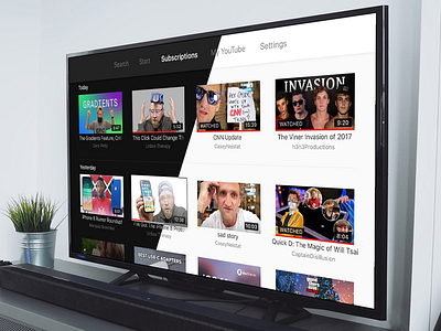
YouTube Apple TV Redesign
YouTube is (together with Netflix) the most used app on my Apple TV. Using it all day drives it me nuts, that the subscription feed is aligned vertically with all these useless profile pictures below.
Wouldn't it be nice to have this beautiful vertical grid with all these Video previews? Combined together with the prominenter watched states and the lovely colors from the new YouTube Design (including the dark mode).
Now it's your turn Google! ;)
More by Alexander Käßner View profile
Like


