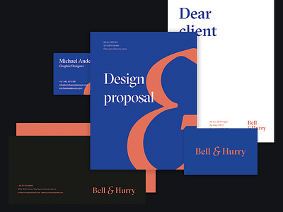
Rebranding B&H
One of the many concepts for our rebranding at Bell&Hurry. Rebranding the company you work for is always a hard task, however since we knew from the beginning what we wanted to achieve, it was mostly just enjoyable work to find the correct visuals. This concept right here didn't fit with the main message. I will share the final one soon with you.
In the attachment, you will find some screens from my presentation for our team. This is the thing that I always do to straighten out my thoughts and explain the concept better.
I'm going to share a lot of UI work because we are mainly focusing on finance apps. So a lot of forms, animations, graphs, dashboard etc. which I seriously enjoy designing.
Thank you and have a lovely day!
Lucie
More by Bell & Hurry View profile
Like


