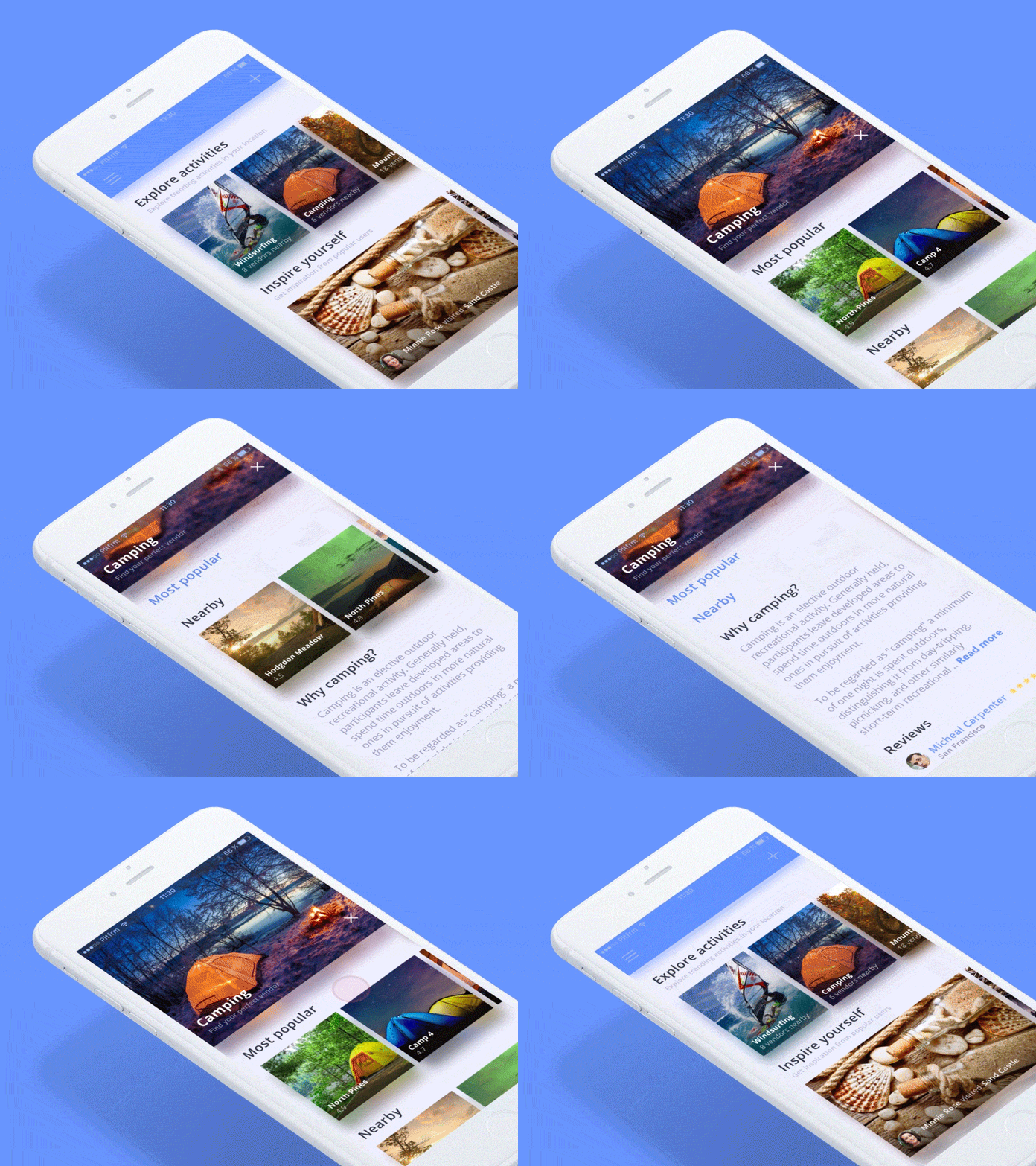
Sticky UI elements (exploration)
The limited space available on a mobile screen provides an interesting constraint in how to best display content and interactions. Sizing and placement of elements should ensure ease of use, and indicate the importance and correlation between actions.
Sticky menus are quicker to navigate. According to usability study by smashingmagazine.com, sticky navigation could cut 36 seconds off of a five-minute visit. Of course, keeping visitors in the app longer is only a benefit if you are enhancing the user experience along with it.
While designing this mobile app, we were also experimenting with different sticky elements to highlight the most important content. Headlines become clickable elements and it's very easy to show/hide content with swipe or tap gesture.
Design by @Lukas Horak
