'daxm' rebranding
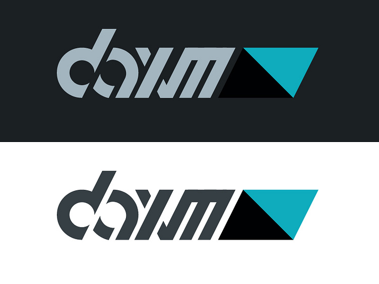
As I began thinking about redesigning my website, it occurred to me that I had never designed a proper wordmark to go along with my current prism symbol.
Using the slant angle of the prism as a base, I came up with a very futuristic/geometric design. This did go through a few iterations, mainly attempts to improve readability, but this is where I'm at right now.
Please critique! I am still learning and trying, any feedback would be greatly appreciated.
