up - logo concept
Hey guys!
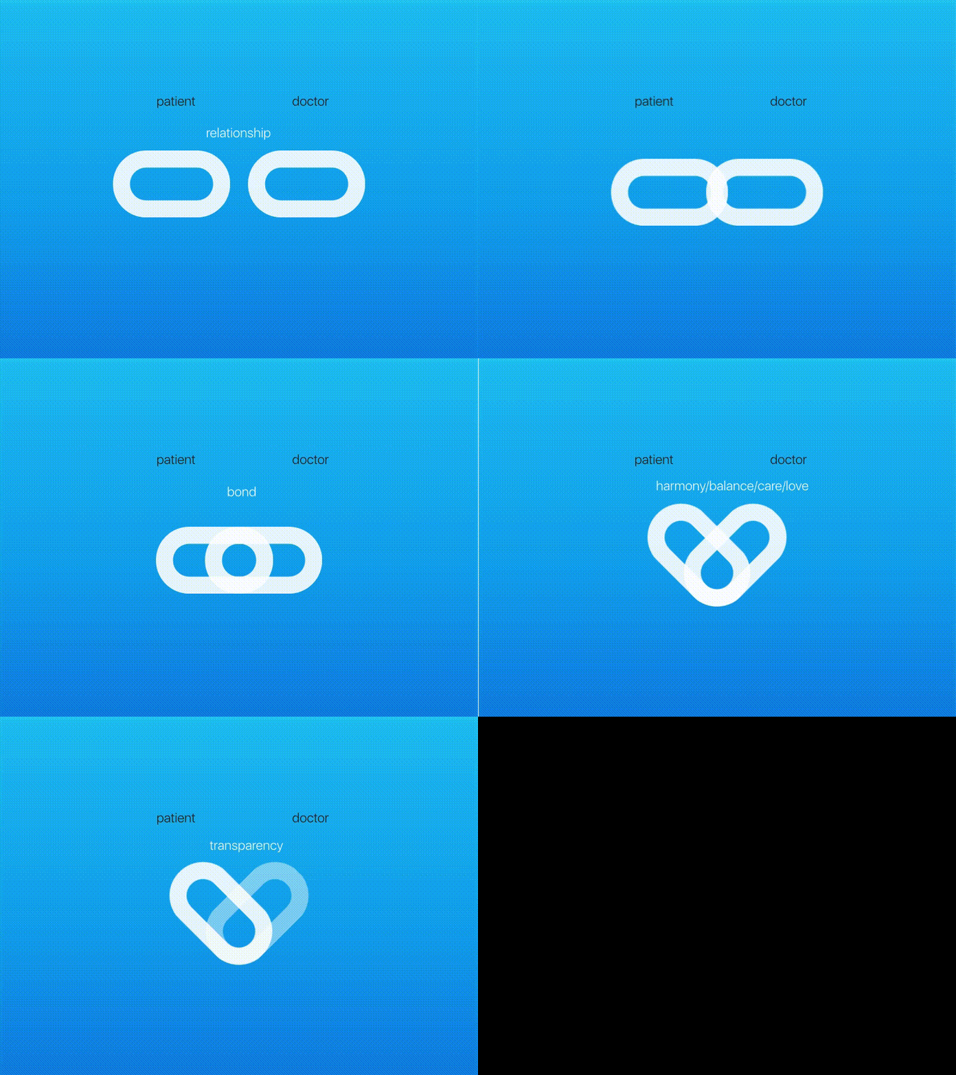
This is a quick animation that explains some concepts I wanted to express with the up logo.
Up is a mobile app that connects patients with doctors, so I wanted a logo that expressed this important relationship.
Some concepts that I wanted to materialize: bond, harmony, balance, caring, love and transparency.
The pills represent doctor and patient, together they form a harmonious and caring relationship, in the form of a heart.
The super smooth gradient background provides a feeling of calm, and gives a touch of blue to the transparent pill.
Transitions are delicate, giving a sense of caring, like the cautious movements of a doctor's hand. The transparency of the pill on the right adds some lightness and transparency while also giving a clear distinction of 2 parts.
What you guys think?
