Legibilitas!
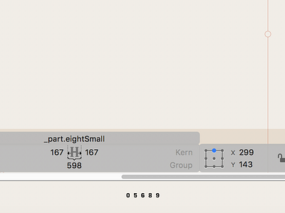
Working on mono neogothic figures for fractions, superior, and inferior positions. Because this is a monospaced typeface they have to be tiny in the fractions. So I’m having to carefully massage the outlines to keep 0, 5, 6, and 9 from being easily mistaken for 8.