Mobile CRM - Motion Design Exploration
Our creative team has been crafting a mobile CRM experience for our client Keller Williams. During our design process, the Product Design team partnered with our client to define a set of motion design principles for the product. This partnership ensures that we’re creating a motion language that both enhances the user's experience and ties back to the Keller Williams brand.
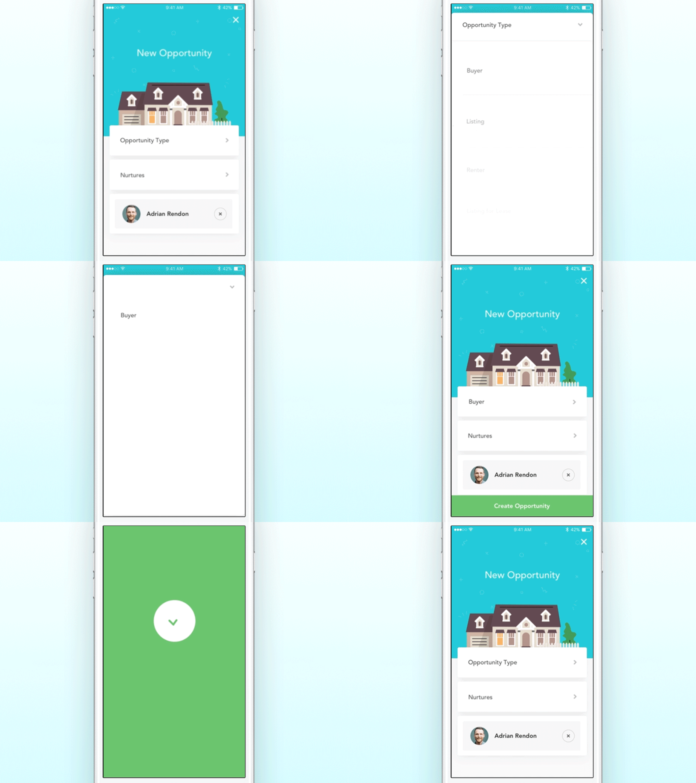
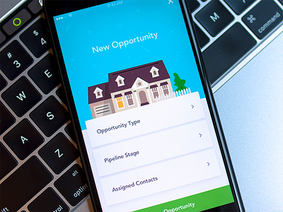
Here is an example of a ‘create a new opportunity’ flow. As a real estate agent completes this flow, they are inputting information to add potential business into their pipeline. The use of expanding cards gives the user a sense of place, while keeping the form easy to understand. Once completed, the CTA and success screen morph into one another, right before giving the agent a congratulatory ‘done’ message. All of these interactions work in tandem to create a fluid, elegant experience.
For more insight into what the team is working on with Keller Williams, be sure to follow along at @Handsome.
Special thanks to my teammates @⋈ Sam Thibault ⋈, @Willy Morgan, and @Christine Soules.
Made with Principle for Mac.

