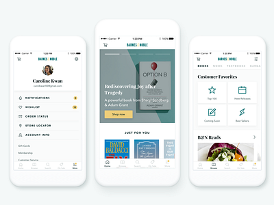
Barnes & Noble Redesign
First shot! Shout out to @Alison Harshbarger for the serendipitous invite.
This is a redesign concept I explored after having a world of trouble using Barnes & Noble's current iOS app. Better utilization of white space and a revamped navigation system are the primary updates, along with an icon refresh and more consistent use of typography.
More by Steven Hanley View profile
Like


