Binned Branding Case Study
Hi friends!
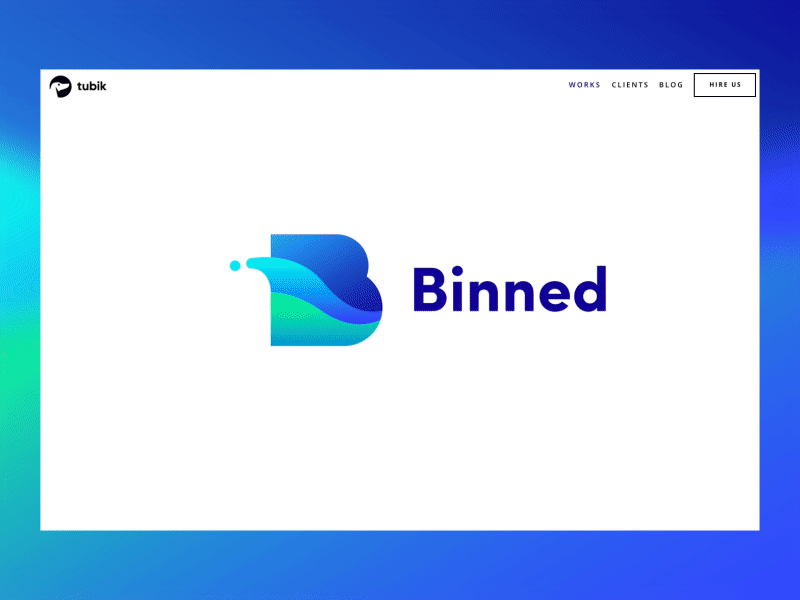
Branding is not just the appearance – it is the story, the message, the idea people get about the service or product. Recently we showed here the logo designed for Binned, the company which contributes much to the clean and healthy environment for the local community. Today's shot presents the detailed case study showing all the creative path through the initial concept and iterations up to the final logo and its implementation on different surfaces and objects. Catch the wave!
For more detailed cases sharing the flows of design projects on UI/UX, branding, illustration and animation, welcome to see them in the portfolio of Tubik Works. Join in!