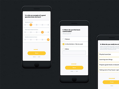
Worbby Mobile App UI - Onboarding 2
Continuing to move the Worbby web app UI design forward. Here's a sneak peek preview at second half of the onboarding process for the new users.
Worbby is going to look great on your phone. Employing a mobile first approach. This screen is a client side UI of the web app experience. More coming over the next few weeks!
View the full showcase, project context, and process in more detail on Behance »
Live in Brazil? Interested in offering your services on Worbby? Register here: worbby.com »
It’ll be coming to more countries later next year.
Thanks!
—
Looking for a brand, web, ui designer? I'd love to hear from you. Email at: sasha@blueandyellowdesign.com
More by Sasha Lantukh View profile
Like


