Transaction feedback
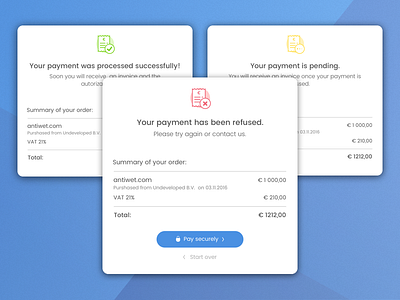
These are the cards for transaction feedback.
Because one of the basic rules in design says "People don't read" I used icons with corresponding colours to make it more visual.
For more details check my Behace project: https://www.behance.net/gallery/54443259/Checkout-process?
More by Agata Ageieva View profile
Like
