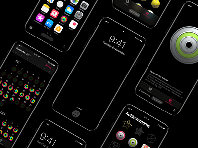
iPhone 8 - Concept navigation screens
All the screens I designed for the concept.
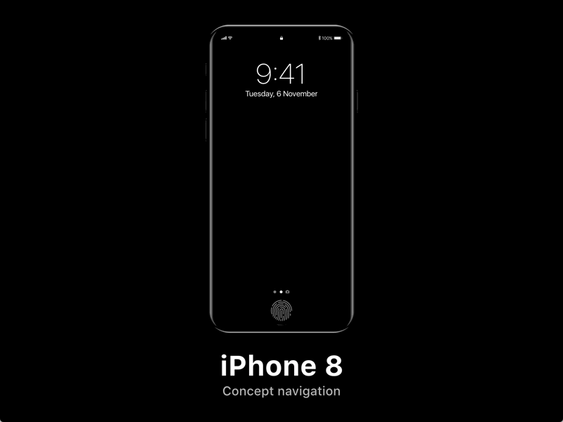
iPhone 8 - Concept navigation
A concept about a new navigation on iPhone 8 based on rumors, the new iOS 11 and on the Scott Hurrf's studies on "How to design for thumbs in the Era of Huge Screens".
In short words, iPhone has a total touchscreen screen without physical Home button and iOS 11.
Lockscreen
You can unlock the new iPhone 8 with your Touch ID then the home button acquires a new shape suitable for a bottom-oriented navigation.
Homescreen
On iOS 11, we saw that the navigation bars are totally disappeared, So I thought to move the navigation bar, with the same height, at the bottom of the interface, to allow the user to navigate with only one hand.
As you can see, there are two glyphs at the ends of the screen, the first one allows you to open multitasking, while the second allows you to open in this case, the Music app and it will be totally customizable by the user.
The Home button becomes a button will always allow the user to return to the Home or start other actions, such as the "old" home button.
Apps
The navigation now is totally bottom-oriented, always to allow the user to navigate with only one hand like the majority of the people do on iPhone and other smartphones with a large screen.
As you can see I can come back or share my progress in a very ease way without stretching my finger to the top of the screen or having to use the iPhone with two hands.


