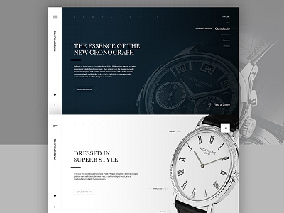
Patek Philippe Elegant & Clean Concept
I decided to go the other way with this shot. Since the aim of the first one was to be powerful, this one is more refined and elegant. I experimented with two contrasts each of which is different in some small details. The idea is to create a fullscreen slider. Still have some ideas for some little things and a super clean menu, but wanted to share this with you asap :)
More by Rok Premuz View profile
Like


