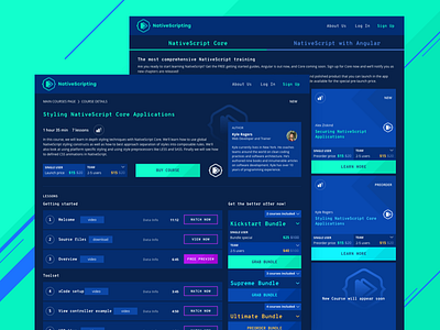
NativeScripting Website
Hi dribbblers!
It's not a secret that a big part of education for programmers of all kinds is found online. Recently we had a chance to deal with the project of this kind called NativeScripting, so here is the shot. To make the environment natural for the target audience and associated with coding, the dark background was applied determining the choice of bright accents for core interaction elements. As well, accent colors on the course cards mark different types of cources. The typography was also considered to support the general stylistic concept and provide high readability level.
To share more ideas on design projects and concepts, we regularly update Tubik Blog with new articles. One of the latest posts tells about Typography in UI. Join in!

