PatronManager Mock Rebrand
A quick mock-rebrand for Patron Manager (see the original at http://patrontechnology.com/) because their current logo felt a little stale to me.
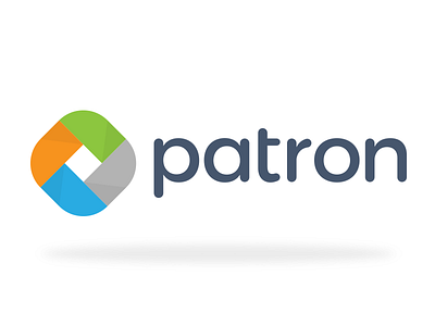
I kept the same premise of a square composed of green, orange, blue, and gray shapes. I ditched the hard, beveled edges and gradients in favor of subtle shadows and rounded edges. The logo mark is complemented by a heavily modified (read: rounded) Montserrat Alternative typeface.
I'm an animator, so logo design really isn't my forte. I'd love to hear your thoughts/criticisms!
