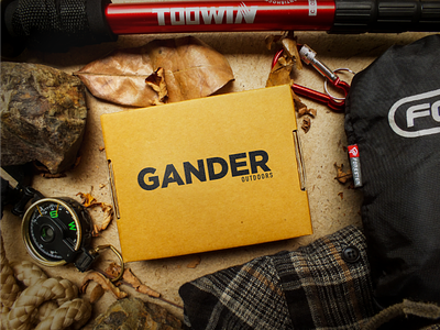
Gander Outdoors Logo Concept


Gander wasn't wild about my entry after posting a winner today but that's okay. Here's mine just for fun.
The location icon inside the letter "A" represents my modern take on navigation in the outdoors. People use their devices to find their way around every day. Very subtle but clean!
The top picks on the contest seem to make me think they were looking for an "iconic" approach rather than a wordmark.
What are your thoughts?