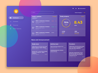
Student e-Learning Dashboard
One day, my school apply a new e-learning system and oh gosh, its UI is terrible. So I decided to bring it a new look with brilliant colors and some UX optimization.
Press "L" if you like it, and please don't forget to visit my full project at: https://www.behance.net/gallery/52935967/Weekly-UI-challenge
Thank you so much
More by Marcus Hoang 🏀 View profile
Like
