SFMA Updated
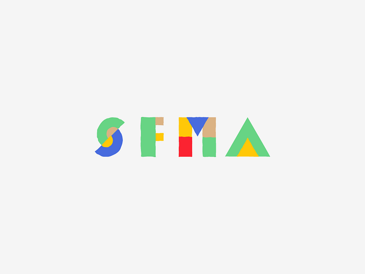
Been working a little more on this logo. I loosened up the crisp lines from the last version to give it more of a hand-done feel. The client thought the old, sharp version looked like a museum logo.
I also tried some new, brighter colors here. Not sure which colors I like more.
More by Jack Knoebber View profile
Like

