Centre for Pediatric Pain Website
The Centre for Pediatric Pain focuses primarily on researching and applying solutions to chronic pain in children.
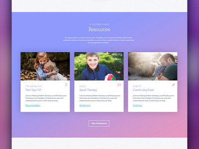
Understanding the website should appeal to both parents and children, we needed to find a balance between the two. Simplistic, but not rudimentary; approachable, but not overtly childish. This balance in visual language was struck by introducing familiar, soft colors and delicate elements throughout.
The pink and purple hues that are used help exemplify femininity and create a motherly tone. Soft, subtle gradients act to bolster this effect while elements such as clouds and hot air balloons are used to help visitors feel comfortable.
Wanna talk about your own web project? Let's chat!
More by Code + Mortar View profile
Like

