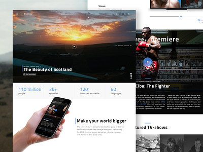
Discovery Channel Homepage Concept
We wanna show you an another part of our Discovery redesign concept.
Here is the thing. There are so many options and sites to watch TV-shows. The same thing goes with Discovery. Too many places and too high chance to lost the key one. We thought that how could be awesome it can be if we collect all cool things on one website.
First, we’ve tried to sort TV-shows. Not the newest decision, but so simple: premiere TV-show, featured shows, latest episodes.
Also, we thought, that homepage should be more open to users. It has to tell them how they can stay in touch with the brand. So we put on the page some info about brand strong sides, app etc. Now the page looks more structured than the current version.
That do you think about the page? Hope, we can post some more very soon.
–––
Want to cooperate with us? Please mail us at hi@malachitestudio.com
We're always glad to share with you our ideas and success.
Malachite | Facebook | Twitter | Instagram | Pinterest | Tumblr

