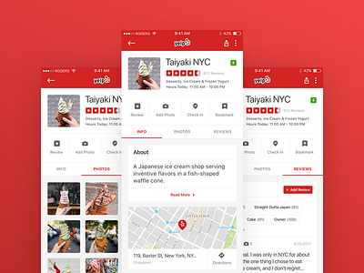
Yelp Mobile Concept Redesign
Here's a concept redesign of Yelp's restaurant mobile page. All the info was originally stacked which made for a rather lengthy scroll, so I split the info into the main three groupings and put them in a slider menu for easy access at the top! Also updated the icons and cleaned up the UI design for a brighter overall look :)
More by Nancy Nguyen View profile
Like


