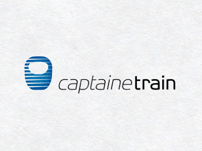
Captaine Train Logo Concept
Interesting project this. Been approached by a young pair of chaps based in Paris to come up with a logo for their own online ticket booking system. Since SNCF lost it's monopoly selling French train tickets, it has meant that anyone with the desire can sell train tickets online.
Their focus is on total simplicity and ease of use, a real opposite to the website experience offered by the main SNCF ticket agency.
You can see a screenshot of an early prototype site with logo in place, gives you a good idea of what I have to work with :
It's still in development, but gives you an idea on how they hope to make the whole online experience simple and quick. They will not be selling ad space, so the entire experience is based on necessary information only.
The main issue was not falling into a 'captain America' cartoon mascot trap. They didn't want a mascot of any kind, thankfully. But they did want a logo that conveyed the sense of simplicity along with some kind of visual cue to 'speed and efficiency'. So really, dumbing down the 'captaine' rather than playing on it.
The logomark needs to be simple, clean, somewhat discreet and compact. The logomark will be used on the site minus the wording.
So this is my first concept for them. A streamlined train shape based on a few French trains, so it's more a hybrid shape. Kept the details to a total minimum, hence only having the windscreen to help convey the meaning.
The idea of the 'lines' was to try and get around the 'captain America' trap, but also implying superhero speed and efficiency. The italics for 'captain' also help imply this without using any cliche imagery.
It needs to be a sensible and clean solution, as it will be nationally rolled out, so an element of neutrality is required.
