The Gourmet Website
Hi guys!
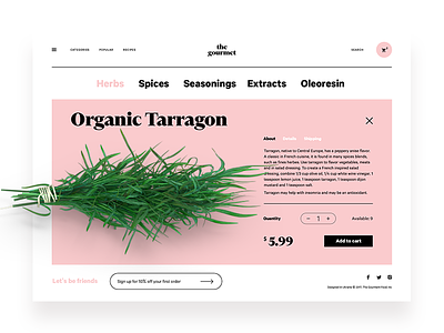
Let's add some spice to the new week: here's the fresh design concept for The Gourmet, the online market for herbs, spices, seasonings and all that kind of stuff. Here you can see a product card presenting a particular item with the prominent image, description, price and ability to add the item to the cart. The minimalist header provides the links to the core areas of the website while hamburger menu hides the extended catalog. Credits for UI concept to Ernest Asanov. Feel the taste!
By the way, you can see that this concept applies design techniques traditional in e-commerce for fashion but the type of goods is very different – they are for eating and cooking. What do you think about such creative experiments? Do you try non-traditional combinations like this in your design practice? Would be great to discuss!
To share more ideas on design, we regularly update Tubik Blog with new articles. One of the latest posts tells about Power of Minimalism in UI Design. Join in!

