Checkout Flow
Hi everyone,
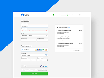
Improving conversion rate with a new refreshing checkout flow is not that easy. I split the process on three steps, rather than putting all in one page.
Here are some rules that I follow when I'm designing web forms:
- Use top aligned labels, for both, mobile and desktop
- Group labels with their inputs
- Bring to light basic helper text whenever possible
- Use one column in your form
- Display inline validation
- Make it simple and fun
Sharing more stuff soon,
Thanks
D
More by Dorin Andrei ♒ View profile
Like


