Rebrand : LogoMNL Studio (www.logomnl.com)

LogoMNL rebrand (www.logomnl.com)
*** LogoMNL is an independent identity and branding house that serve clients around the world. We are accepting outsource, freelance/project-based, collaboration, and partnership. PM me! :)
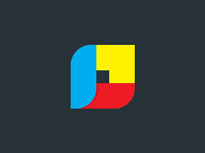
Rationale:
- initial 'L' is embedded on the symbol.
- Arrow pointing upward to denote success in every client I've worked with.
- Colors of our flag
- Sort of cube/box with a hole in the center which emphasizes the idea of "think outside the box".
- in some angle, it looks like a bud or flower which denotes flourish or growth.
- the loop or closed circle symbolize connections and relationships.
- center hole: you have to look at to see the other side of it because the design is more than meets the eye.
- the center hole or the negative space, my emptiness that strives me to fill in.
Created by @designmanila
#logo #logos #logoMNL #logoshop #symbols #brand #branding #brandMNL #brandesign #brandoftheday #logooftheday #identity #identitydesign #design #designer #designMNL #designstudio #designoftheday #creative #creatives #philippines #manila #logodesinger