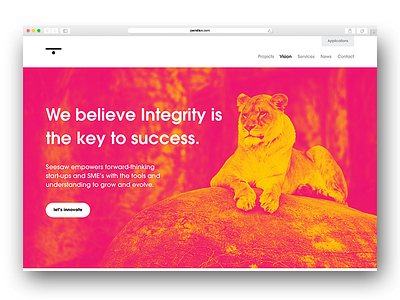
Seesaw Revamp – Homepage
Currently in the process of upgrading Seesaw's website, building on what we currently have but refining the styles and simplifying in a few areas.
The new homepage, not massively different from the first. Been working a lot on the content and vision of the brand as a whole.
The only issue I have with the design is when it comes to building the website and whether I should put a max-width on the imagery so that it stays proportionate without "breaking the design". Which would mean creating white space to the sides on larger monitors.
I'm personally not a fan of using media queries and CSS backgrounds.
Any suggestions / perspectives on how you guys work with imagery would be appreciated.
More by Joe Million View profile
Like
