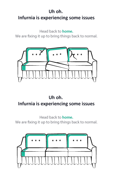
Error Message
" Error messages are usually the last thing on the product team’s UX list, if it’s on the list at all.
The result? Long-winded, contradictory messages, which assume non-technical people will understand the complexity of what’s happening.
Your error message is going to be shown to a person — so shouldn’t it be written as if you were having a conversation with that person?
These are missed opportunities to gain user’s confidence and trust in your solution; I’m sure you know from experience that when someone helps you overcome an obstacle, you feel a deep sense of gratitude."
More by Diana View profile
Like
