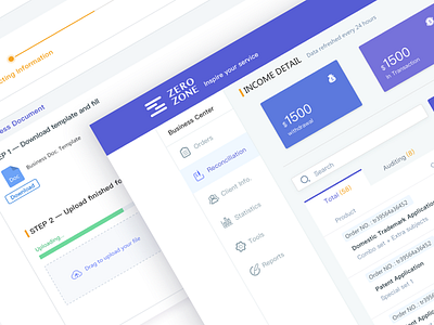
Reconciliation dashboard
Hey guys,
Here again is a SaaS project I have been working on. The website is used to promote our app and more importantly, to provide reconciliation services to our users( mostly are agents).
I use cards and colors to draw user's attention to more important elements, and the immaterial information is hidden so the users wouldn't be distracted.
This is a 0 to 1 project and there is a long way to go to keep improving user experience.
Don't forget to check the real pixels. Please show your support by press "L" if you like it ; )
Cheers!
More by New Beee View profile
Like


