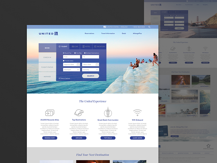
United Redesign - Full View
This is the full view of the just-for-fun project I worked on which was a redesign of this: http://rachelklausner.com/wp-content/uploads/2017/06/United-Screenshot.png
One of the exciting challenges of this project was trying to infer priority in order to simplify: which were the most important elements to be shown, what order should they be shown in, what should be cut? These are obviously just my complete guesses and how I would lay my priorities as a United Marketer.
The header image behind the book / check in widget would be personalized depending on past browse behavior, time of year, and predictions on user preference.
The second section reveals the next four messages I thought were most important after the widget, followed by destination exploration, and a credit card highlight.
