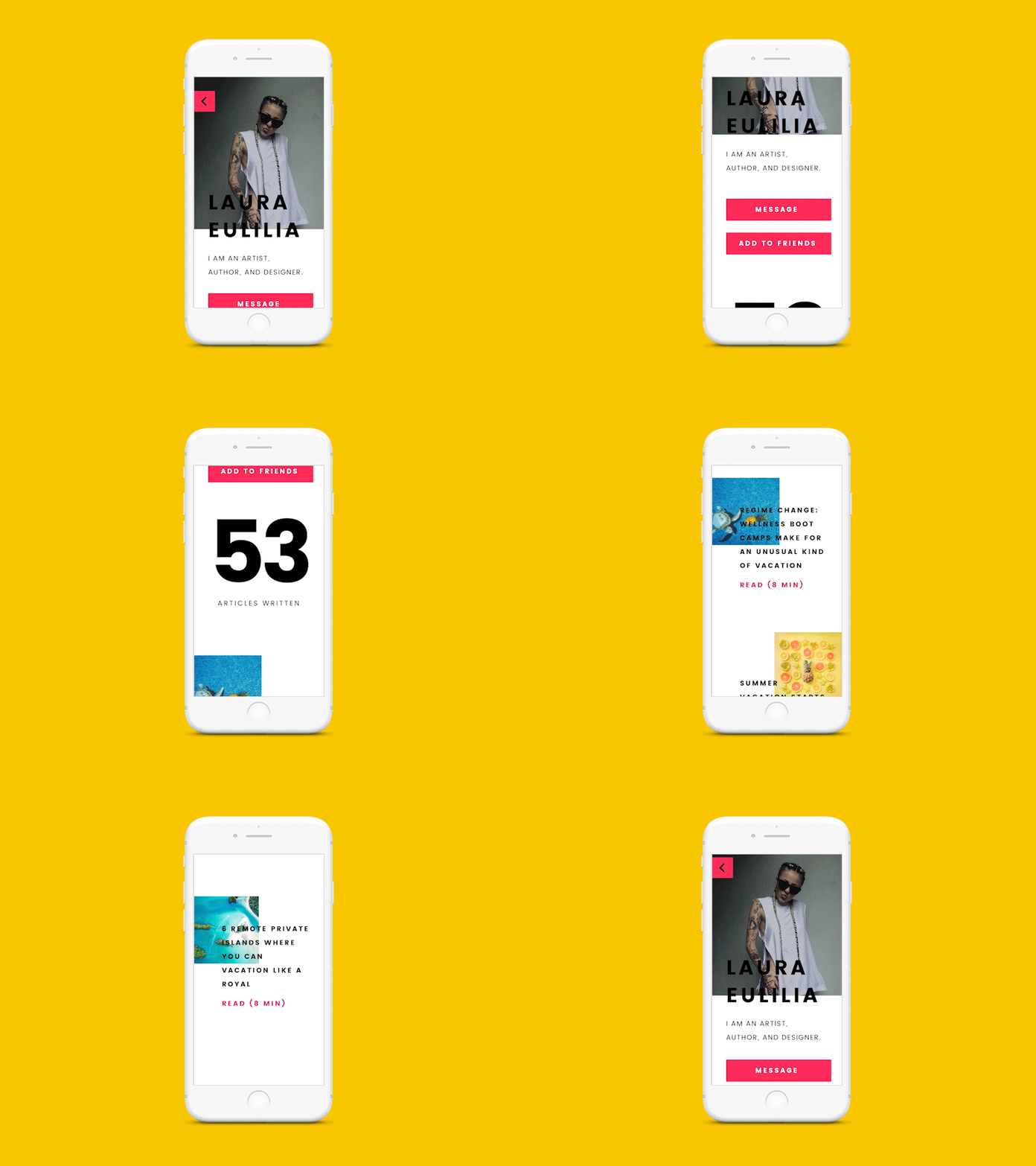
👸 Profile screen for a writing app
Hello again 💛
Publishing another Saturday Design Session creation!
I challenged myself to use a shitload of colors, get rid of minimal typo and really get out of my comfort zone. Let's just say that I'll try to use a shitload of colors some other time, okay?
Also, I know that the design not readable, usable or developable (is that a word?). However, I had a lot of fun and pushed my boundaries a little bit further 😈
Check the attachments for still screens.
PS: Is there any secret cult I need to join to not hate working with Adobe products? Almost gave up on the animation.
Profile photo: https://www.instagram.com/duhovka/
Article headlines and photos: http://www.vogue.com/magazine
Mockup: https://store.ramotion.com/
Good advice: @Marian Fusek
More by Lea Petrasova View profile
Like


