Twitter UI/UX Design Review
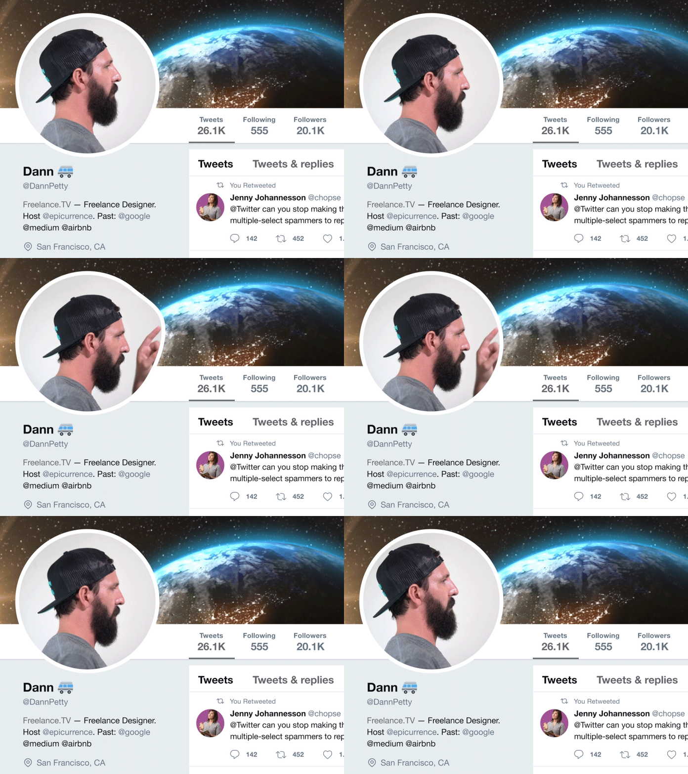
I reviewed the new Twitter design on both iOS and desktop — watch it on YouTube!
I talk about the profile changes, new icons, tweet button placement, and other random UX issues/improvements. I asked a few questions for you in the video—would love to hear your thoughts.
Hope you enjoy it! Let me know if you think I should do another review sometime.
More by Dann Petty View profile
Like
