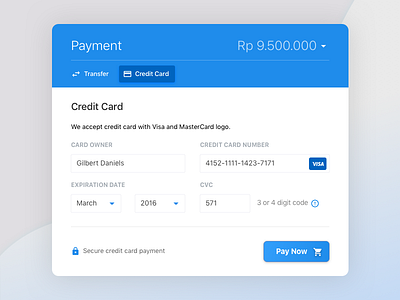
dailyUI #002 - Checkout V2
I joined this group on slack called The Designership and post my work there for feedbacks. They are:
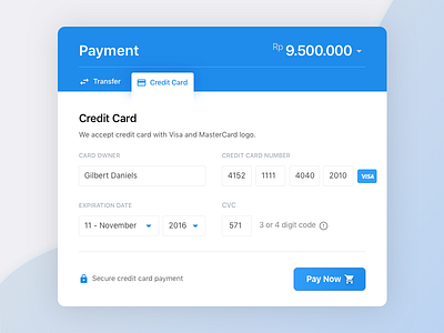
✔ Refine some paddings and positionings between the text and icons.
✔ Number beside month in expiration date section to reduce errors and speed up the input process.
✔ Divide the input text field from one to four in credit card number.
✔ Try to relate the tab (transfer, credit card) with the content.
Let me know what you think about it or whether you like the new or old version of this design :D