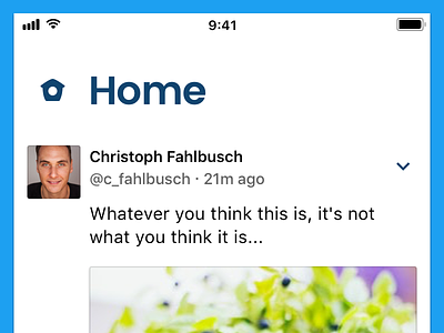
Twitter - Home
Since Twitter redesigned its iOS app, I wanted to incorporate a few tweaks to the experience, keeping general design rules, and specific mobile design rules in mind. Changes made:
- Tweet button right above the tab bar for easier reach
- Profile sits within the tab bar for easier reach
- Avatars are kept square for greater detail visibility
- Fonts and spacings are increased for better legibility
- Bolder icons for more legibility
What do you think about the current Twitter experience so far?
More by Christoph Fahlbusch View profile
Like

