Kit Homepage Archived Version #2
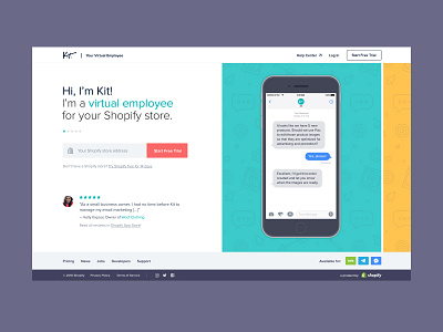
This was the very first design I did for the Kit homepage redesign back in January. The idea was to split the page in two: Kit introducing itself on the left and a carousel showcasing conversations with Kit on the right.
The carousel would go through multiple animated conversations, each showcasing a different task Kit could carry out—one for Facebook Ads, one for email marketing, etc. Each slide had it's own color and set of illustrations.
This design was approved and ready to go, but shelved due to a lack of development resources. Over the course of five months, it was slowly simplified to reduce development resources (see: http://bit.ly/2rU5sXf) and then eventually scrapped all-together.
More by Josh Martin View profile
Like

