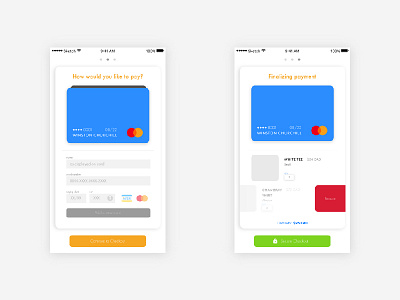
002 - Payment: Add New Card & Secure Checkout
002/100
Today's challenge was designing a payment screen.
I hope I did it justic! I skipped the personal information page and dove right into purchasing and finalizing order; I also designed it so you can view and edit your cart instead of having to exit and going back to the beginning... And then inputting the address and email again.
I think it's simple and usable with just the right amount of color. I'm open for feedback and suggestions on how to improve!
Thanks for viewing! Hit the '❤️' to show some love.
More by Annie Ngu View profile
Like


