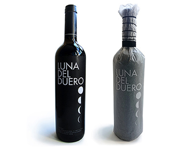
Packaging for vine «Luna del Duero»
A brand has been created for a red wine of artisan quality, which stands out among the great competition that has a town like Peñafiel, famous for its Ribera of Duero wine.
The label is designed vertically, starting with the name of the brand with a dry stick typography quite powerful, elegant and clean. The last letter of the word «Duero» is a fusion with the phase of the new moon. This one is changing at the same time that it descends by the bottle to the other phases of the moon.
It has wanted to convey the idea of transparency, taking advantage of the nature of a material such as silk paper. It's held by a thin rope forming a degraded that clothes the neck of the bottle.
If you want, you can see the whole project in the following link: https://www.behance.net/gallery/52004933/Packaging-vino-Luna-del-Duero
