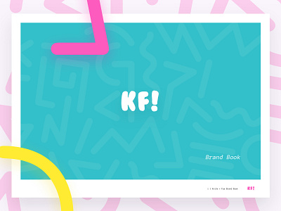
Brand Book: Knife & Fox
Uploading the final shot from a branding project I did last summer for a good buddy of mine.
You can view the entire brand book here: https://www.dropbox.com/s/1v97y1w2xotozte/KF-Brand-Book.pdf?dl=0
- - - - - - - - - - - - - - - - -
Logo/Shot: Knowing that the brand was meant to convey a youthful, optimistic, 1990's California vibe (it wasn't as played out last summer as this summer), the decision was made to do two things with the logo. 1) To use a font that mimicked the font you would see on a pack of bubblegum you bought in 1990. And 2) to use an exclamation point at the end of it.
A company’s mark should always reflect the soul, spirit, and passion of the brand itself. When assessing our personality and values, the symbolism that truly captures the essence of youthful 90’s California optimism was....bubblegum.
The company, prior, had been using an ampersand or a + to tie the K and F together. I played around with a bunch of horrible ideas, like making the bowl of the ampersand a fox tail, etc. In the end, with the brand meant to be 'loud' and 'confident', I felt like the exclamation point was most fitting.
- - - - - - - - - - - - - - - - -
PROJECT: Last summer I had a blast doing a branding project for a design agency relocating from Seattle to Los Angeles. Needing to evolve from PNW hipster to The OC, I thought it was a fun challenge. The final result was a 90’s themed California with an ode to Saved By the Bell.
- - - - - - - - - - - - - - - -
CLIENT: @Knife and Fox is a product design company located in the Silicon Beach area of Los Angeles. Hit up their founder @Shea Lewis - they are accepting projects!


