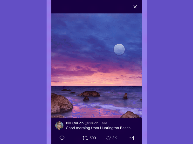
Twitter Redesign: Immersive Media
Hey all,
As part of the Twitter redesign project, we thought about ways to incorporate more color into Twitter, without distracting from content.
This shot is an example of our photo-viewer, which calculates the dominant color of a photo and displays a related shade as the background.
We thought this would be a fun way to make our interface reflect the tone of a given photo, and to make Twitter feel like a window into content.
Any feedback is appreciated and thank you!
More by Twitter Design View profile
Like


