🚧 Konstrukt — visual exploration

What's up, peeps? 🏀
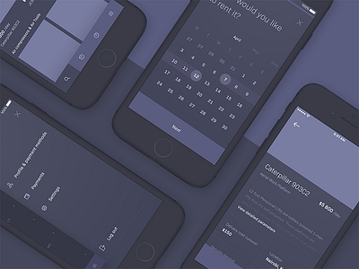
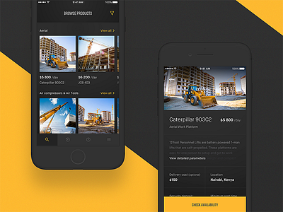
Do you remember this minimal, construction-related app I presented some time ago? I realized I haven't shared the final outcome of it's visual layer here, so there you go!
We decided to go for a condensed, American-ish typeface here and there (wanted to play with the bold, Caterpillar-like vibe) + a dark, content-first UI, to keep users' focus on the products... and products only 🚜
As usual, I attached some more pixels for you to see 🎁
—
Make sure to follow my team at Tonik to stay updated with our daily work. Also, check out our profiles on Facebook and Instagram.