Typo Slides


A few slides from a design proposal for a large project we worked on recently.
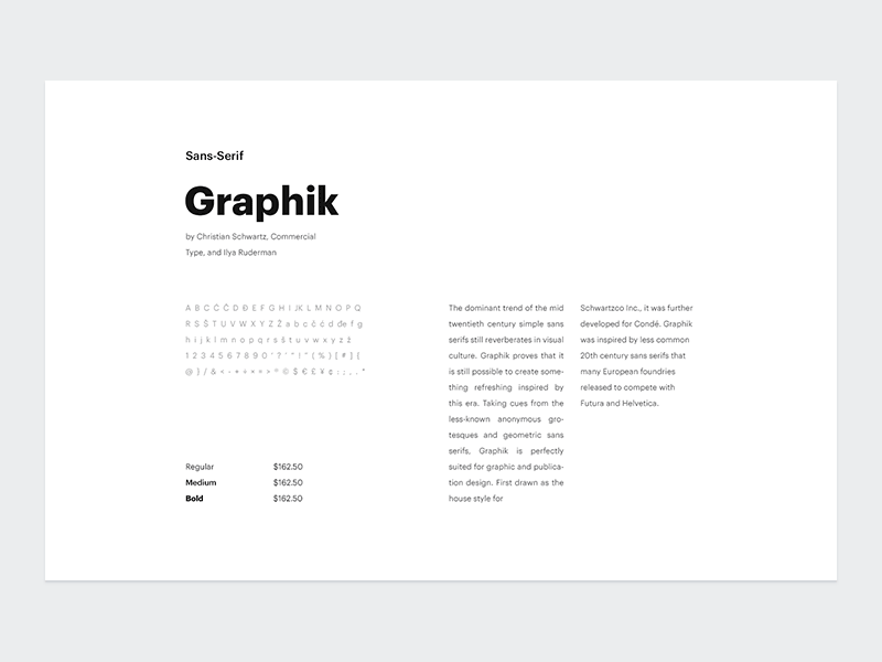
I wanted to do research and set a typography direction for the digital side and most importantly for the website of the brand. Later we decided to go with this font combination for all sorts of materials.
Although the brand is tech-oriented, my goal was to achieve a humanistic feeling while going with something inspired from geometric sans-serifs.
The project needed a recognizable main font, used for all types of media and I bet on the sans-serif. Also, there were subtle UI elements on the website, which needed careful crafting to avoid clutter—the monospaced font was just right—as well as sections with text-heavy articles, where the serif came to the rescue.
We are going to show what happened next soon, so stay tuned ✌️