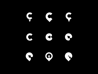
Click Location Logo Exploration
The title rhymes. Even thought it wasn't planned. So as the name applies the logo idea revolves around words Location and Click. So i either used the arrow for click or the letter c. The second is my favorite so far and the bottom left aint bad.
More by Vlad View profile
Like
